-
 Selma Hallqvist
 -
.png?width=1080&height=1080&name=Untitled%20design%20(8).png)
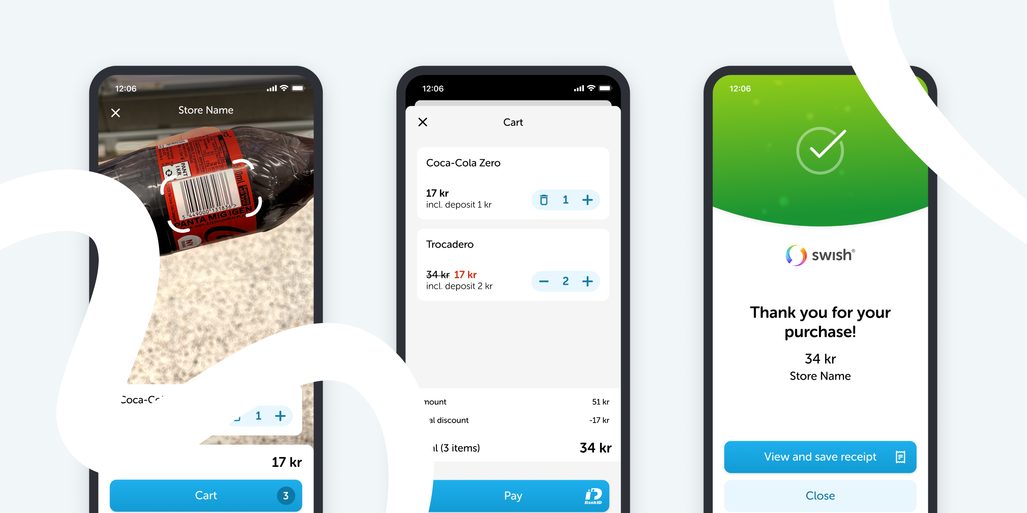
In March, Swish launched a new self-scanning solution where the customer can manage the entire purchase directly in the Swish app. The service has been piloted for a period of time and is now gradually being rolled out. As long-term design partners with Swish, Bontouch played a big part in developing this feature. In this article, we will walk you through the process from pilot to release from a design perspective.
Branching out
Consumers appreciate not having to queue and being able to quickly and easily make their purchases on their own on their mobile phones. At the same time, not all consumers want to download a new app and register as soon as they buy something in a store. This is where Swish comes in. It's an app that most people already have and feel familiar with, so the threshold for getting started with self-scanning is very low.
A core aspect of Swish's brand is simplicity, and its users expect a consistent design with a clear focus. Branching out into self-scanning is quite different from what Swish usually offers, and the last thing they want is for users to feel like they’ve lost focus. However, offering a quick payment solution aligns well with Swish's identity — it's what the app is all about, and it's also the essence of self-scanning. This kind of functionality can become very complex - so how can one balance designing a solid feature - without disturbing other functionality?
Finding a balance
Approaching this design offered an exciting opportunity for creativity. While a self-scanning feature in your phone aims to provide a faster and more convenient shopping experience, it is, in fact, quite a complex feature to design. Presenting various product types, including weight-based items, along with their prices, some featuring discounts, has the potential to overwhelm users with cognitive overload. Given this, the balance in the interface had to be considered carefully.
Circling back to Swish as a brand, it was important to ensure the design was clean and easy to use. To streamline it, the feature was integrated directly into the scanner. This way, it didn’t have to take up space in the app with a whole tab that could distract from other use cases. By accessing the feature from the scanner, users can quickly identify unique stores by scanning a QR code, eliminating the need for a login.
Another aspect that was considered is that merchants have their own unique brand and will showcase their products through the app. There were discussions about whether to provide brand customization options, but in the end, it felt like allowing too much freedom for each brand to diverge could lead to confusion. Therefore, it was decided to keep a Swish-branded design, ensuring users feel like they are shopping at the merchant’s store while remaining within the Swish app.
 Early sketches from design iteration.
Setting the scene
To get the insights needed early on, within a short time frame - several approaches were combined. As a first step a great deal of time was spent testing all the existing self-scanning solutions out there to put ourselves in the context of a shopper. At the beginning of the design process, the main focus was service design. Store scenarios combined with low-fidelity prototypes were made for remote usability testing. This was beneficial in understanding what level of instruction the users needed to get going. After this, it was time to build high-fidelity prototypes to test on real-life users. Here, plenty of insights were gathered regarding Swish users' perception of the feature in relation to the existing app. In this step, the UX and UI were also evaluated.
To evaluate the purchase experience, a quick proof of concept (POC) was developed focusing only on the scanner. Because of the POC, the feeling of scanning an item with a phone in hand could be tested, which is difficult to replicate in a Figma prototype. A large part of designing the feature was crafting clear instructions for in-store use. We did extensive research and customer journey mapping and worked with a UX writer to create informative and user-friendly signage.
The pilot
The most valuable part of the testing process was the pilot project. Nothing beats the real deal. Swish set a pretty narrow scope and short deadline to be able to actually do production pilot testing in a real store when they were given the chance. It’s not always easy to find a merchant who’s up for risking their revenue by testing a completely new feature that is not yet verified. Swish found a smaller grocery store in a Swedish Ski resort named Branäs. The size of the assortment was small enough for us to quickly integrate with our backend but still had a wide range of products to really put the scanner to the test.
The store was the only one within a three km reach, and due to its size, they had problems with long queues at rush hour periods like lunchtime or right after the After Ski. The item average was around four per purchase, which made it ideal for this kind of quick shopping feature. Most customers drop by for complementary shopping items like pasta, milk, or ketchup. This made the pilot project a win-win for both parties.
The product team spent two days on-site in Branäs to kick off the pilot. Signage was put up in several places throughout the store, which allowed users to start scanning at any time during their visit. Some users wanted to start scanning when entering the store, while others got to the checkout, saw the long queue, and wanted to start self-scanning from there instead.

As the store opened and rush hour came closer, more people decided to try self-scanning. It was interesting to observe customers trying out the scanning functionality and we also managed to interview many of them on their way out. Talking to customers after they’ve just used the service was valuable, and overall, people found it easy to use and said they would use it again. The average purchase for the users opting to self-scan included around three to four items which aligned with expectations. While most users smoothly navigated the self-scan process and left the store after payment, others, possibly less familiar with self-scanning, paused at the cashier's desk to verify their purchase with a receipt. Everyone expected the receipt to be saved automatically in the app; however, almost no one actually looked at it, probably due to the small purchase amounts.
To follow up on the pilot, phone interviews were conducted with the staff who had been working during the busiest hours. It was great to hear about their experience as staff, which questions that came up regarding the feature, and how they handled those. Get a first-hand look at the Pilot Project with Branäsgruppen in the video below.
Refinements
With all the insights and learnings from the tests, the whole product team gathered for a workshop on which features and improvements were needed in the first public release. We used an effort vs. impact matrix to map it out and help us prioritise. After this, the project went into phase two, where focus was on refining the feature and polishing the UI overall. Transitions, animations, and accessibility features were improved, timings and some layouts were tweaked, and the scanner's performance was increased.
Working with screen readers - trying to make the scanner accessible for people with visual impairments - was challenging. Some screen reader adjustments that were made were to remove time out after scanning a product, letting the item stay in view until the next scan, and grouping text so the reading order made sense. But the biggest challenge is the fact that you need to point the scanner at the barcode in order to scan a product. When performing usability testing with visually impaired users, feedback was received on the scanner and there was a recommendation to look into Seeing AI. This artificial intelligence application, developed by Microsoft, helps users with visual impairments to identify objects and people in their surroundings by audibly describing the objects. Unfortunately, there was not enough time to include this in the first release but there is interest in exploring it more as development continues.
Rounding off this second phase, Swish felt ready to go to market, and in March, the first public release was finally made!

To be continued
Returning to the start of our post, Swish aimed to introduce a feature in the app that upholds high usability standards and maintains the trust of their users. The goal was to enhance the user experience without overshadowing the core functionalities, which we feel confident we did. The team is very happy with the feature we have built together and excited to continue working on all aspects of it, improving by learning from every merchant who implements this in their store.
Would your store like to offer self-scanning with Swish?
Swish is now accepting applications from merchants who want to offer self-scanning with Swish in their stores. Read more about it on Swish website.